CREATIVE STRATEGIST
Framing Ideas within the Origin Point.
Branding Systems, Art Direction, Web, UX/UI, Illustrations, Social Media, and much more.


Logos & Identities
A strong identity does more than introduce a company; it creates a recognizable visual language that can grow with the brand. This collection brings together logo systems developed for hospitality, wellness, fashion, food, lifestyle, and premium service businesses. Each identity is designed to balance distinctiveness with flexibility, providing clients with a clear foundation for digital platforms, printed materials, packaging, signage, future campaigns, and all journey touch points.



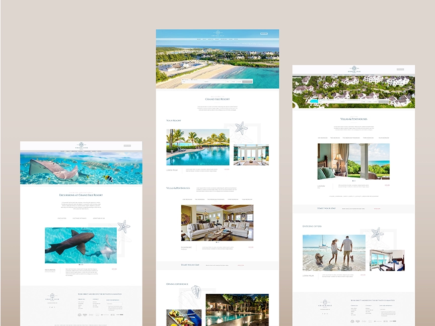
Grand Isle Resort
Hospitality & Resorts
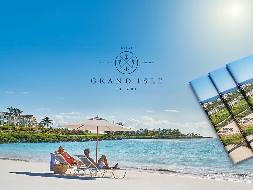
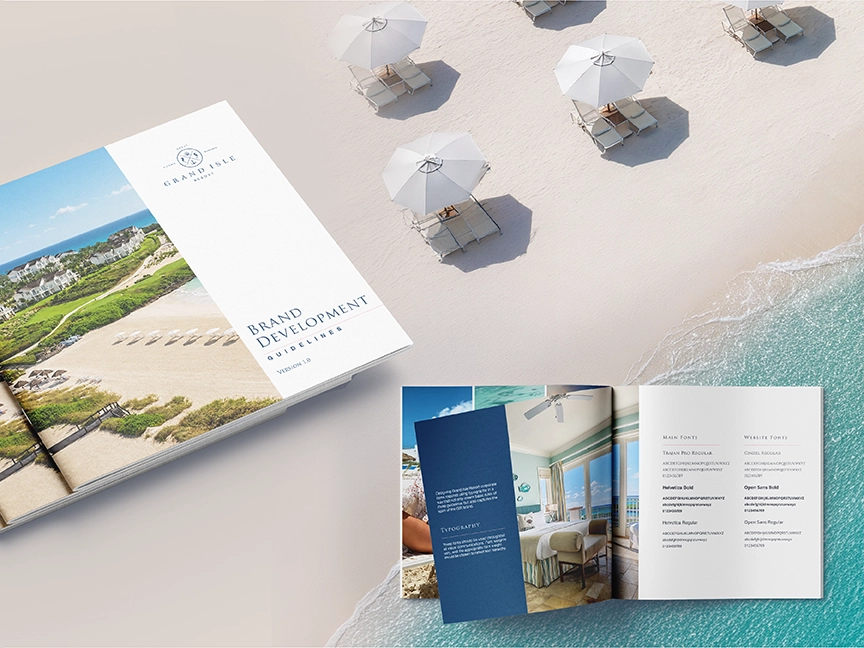
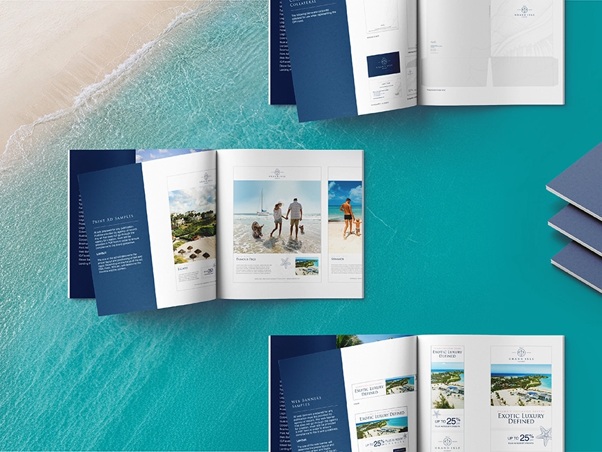
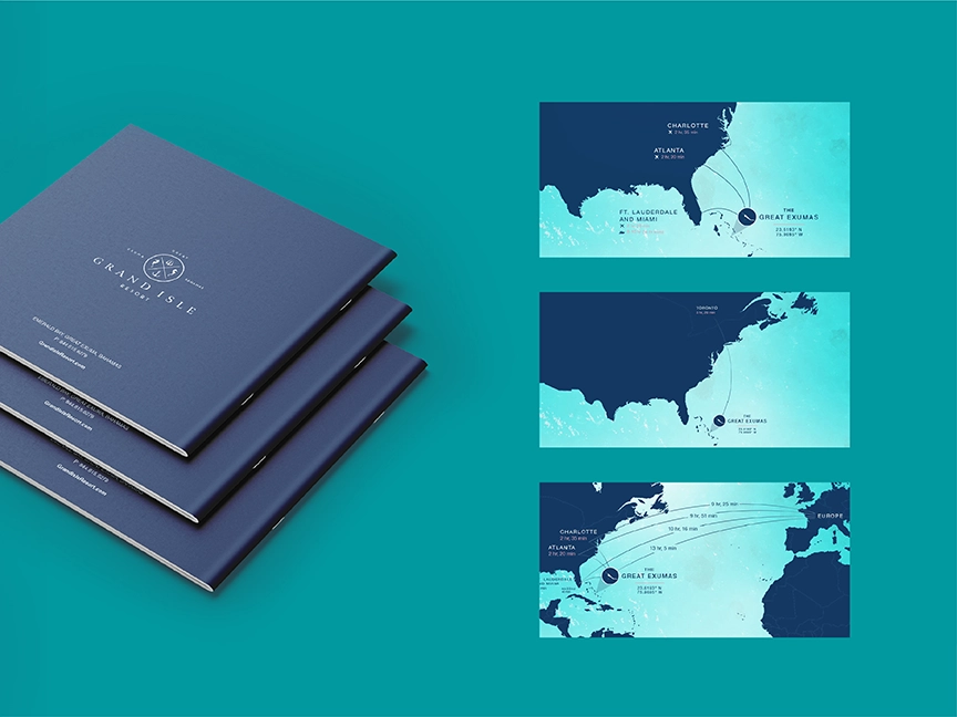
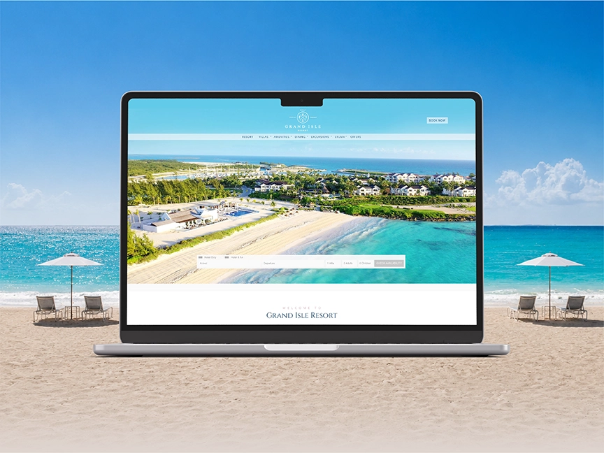
Grand Isle Resort required a brand system that could communicate the relaxed beauty of the Exumas while preserving the refinement expected of a luxury resort. The creative direction pairs serene coastal imagery with an understated navy-and-white palette, elegant typography, and a nautical-inspired identity.
The system was extended across brand guidelines, advertising concepts, editorial layouts, and resort collateral, creating a consistent experience from the first marketing impression through the guest journey. The result is a polished yet approachable identity that positions Grand Isle as an exclusive island escape without losing its natural sense of place.
Key Largo Fisheries
Restaurants
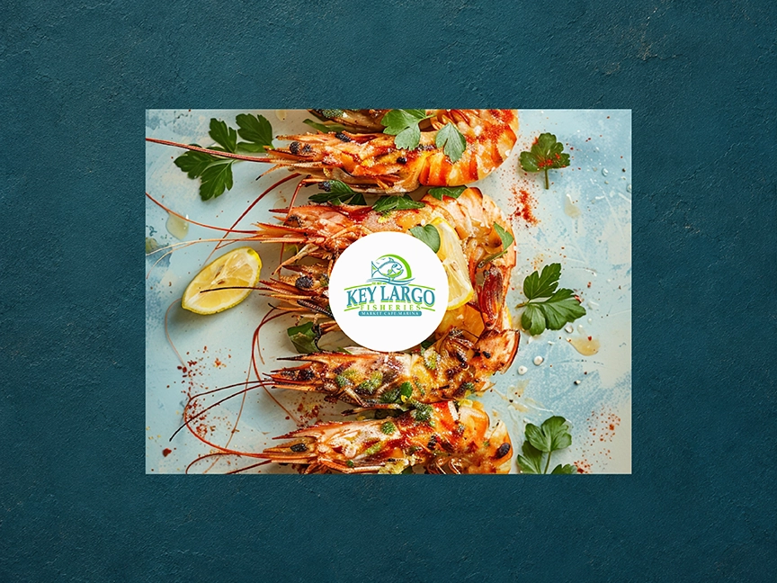
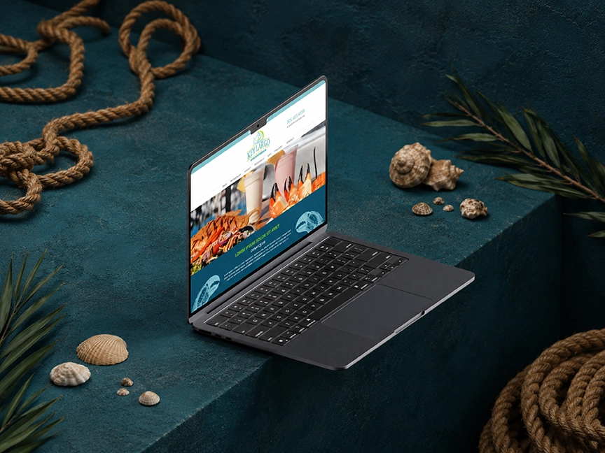
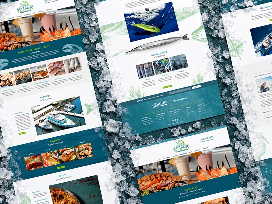
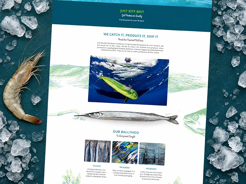
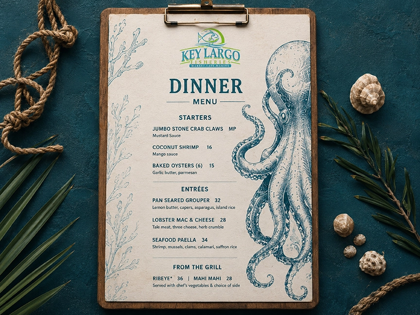
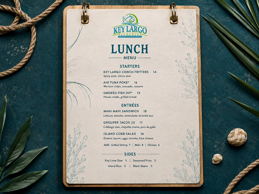
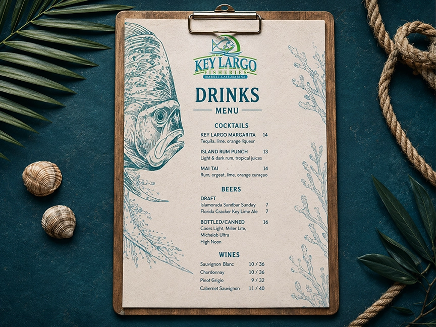
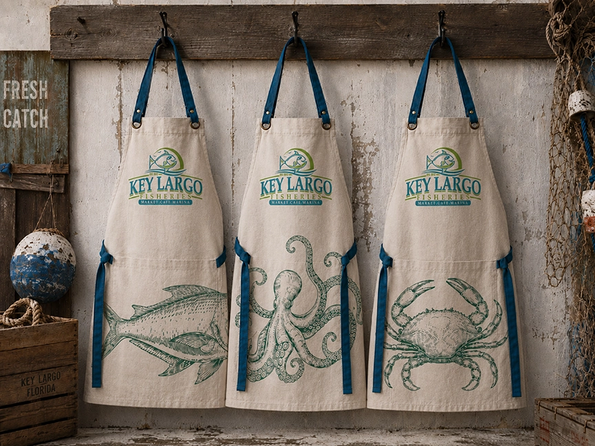
Key Largo Fisheries needed a digital and visual presence that could reflect both sides of the business: a working waterfront seafood market and an inviting local restaurant. The design direction draws from the textures, colors, ingredients, and maritime character of the Florida Keys.
A refreshed website experience organizes the company’s restaurant, market, product, event, and boating information while vibrant food photography makes freshness the central visual story. Nautical styling, illustrated marine details, deep teal surfaces, and energetic lime accents help the brand feel authentic, accessible, and unmistakably connected to the water.
SeaStar Spa
Medspas & Aesthetic Clinics
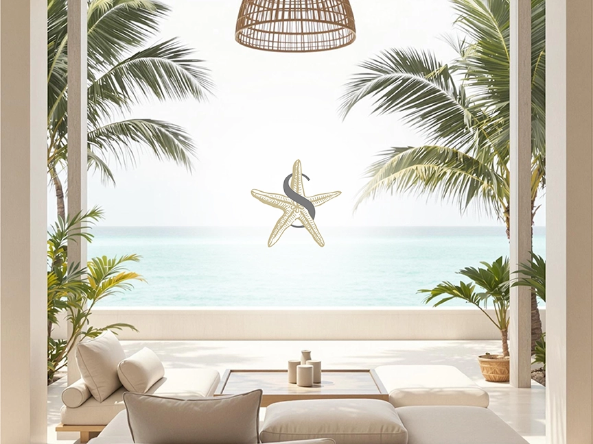
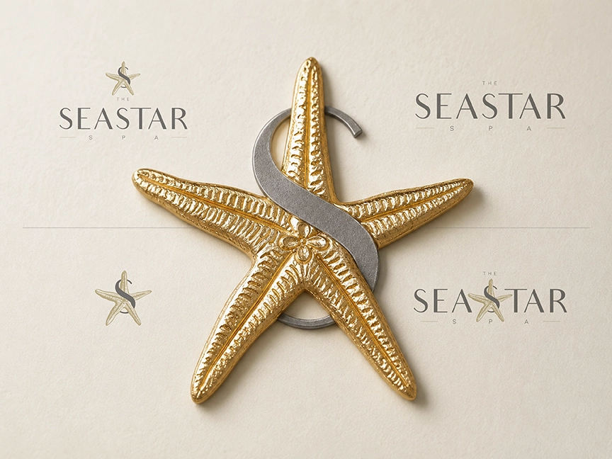
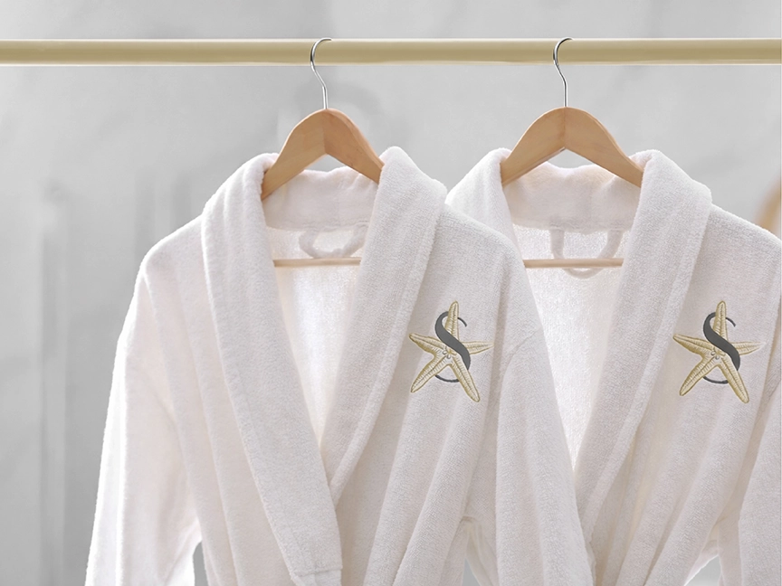
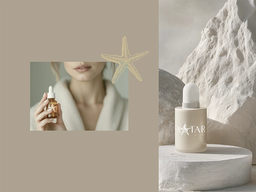
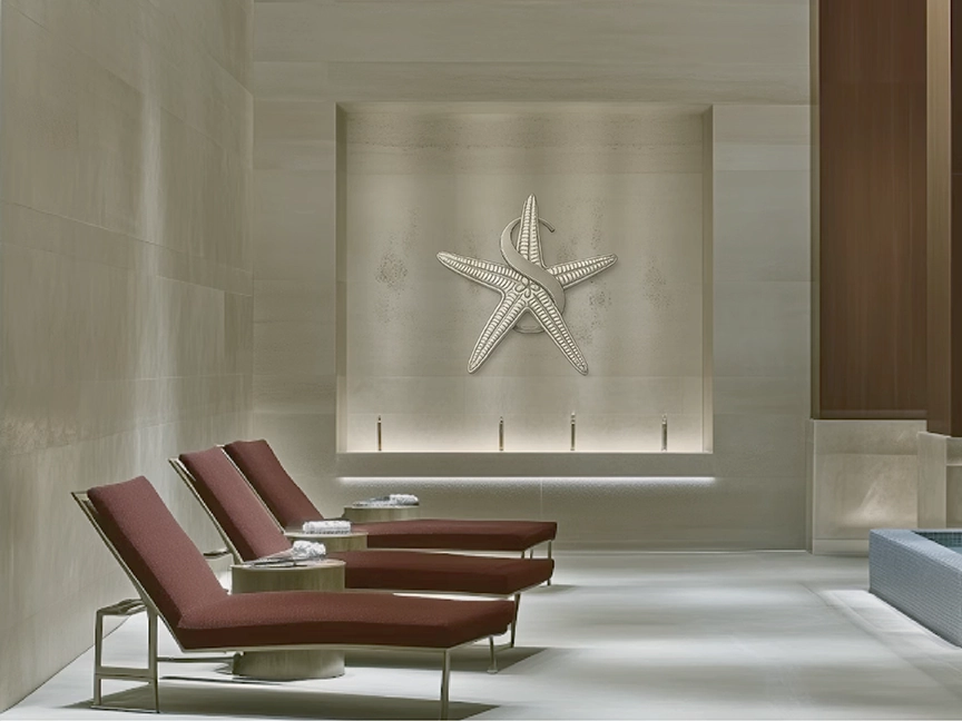
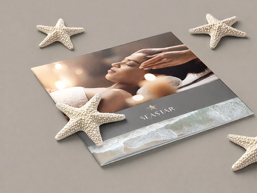
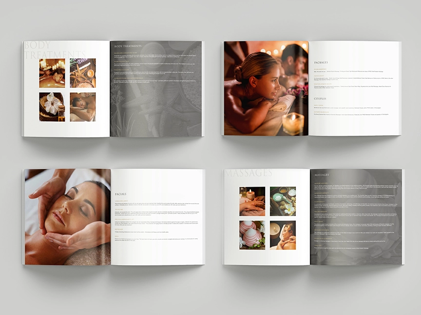
SeaStar Spa called for an identity that could bridge clinical expertise and resort-inspired relaxation. The visual concept transforms the familiar starfish into an elegant brand symbol, combining organic coastal imagery with a fluid monogram and refined metallic finishes.
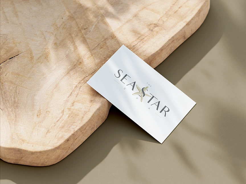
A soft neutral palette, restrained typography, and generous space give the brand a calm, premium quality suitable for both aesthetic treatments and restorative wellness services. Applied across stationery and branded touchpoints, the identity establishes SeaStar Spa as sophisticated, tranquil, and contemporary rather than overtly clinical.
The Line By Dariana
Fashion
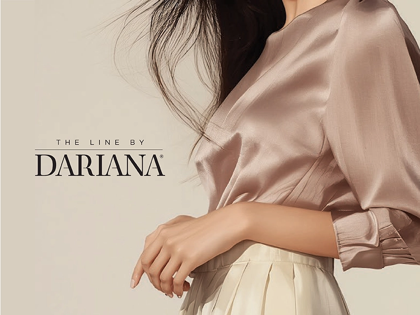
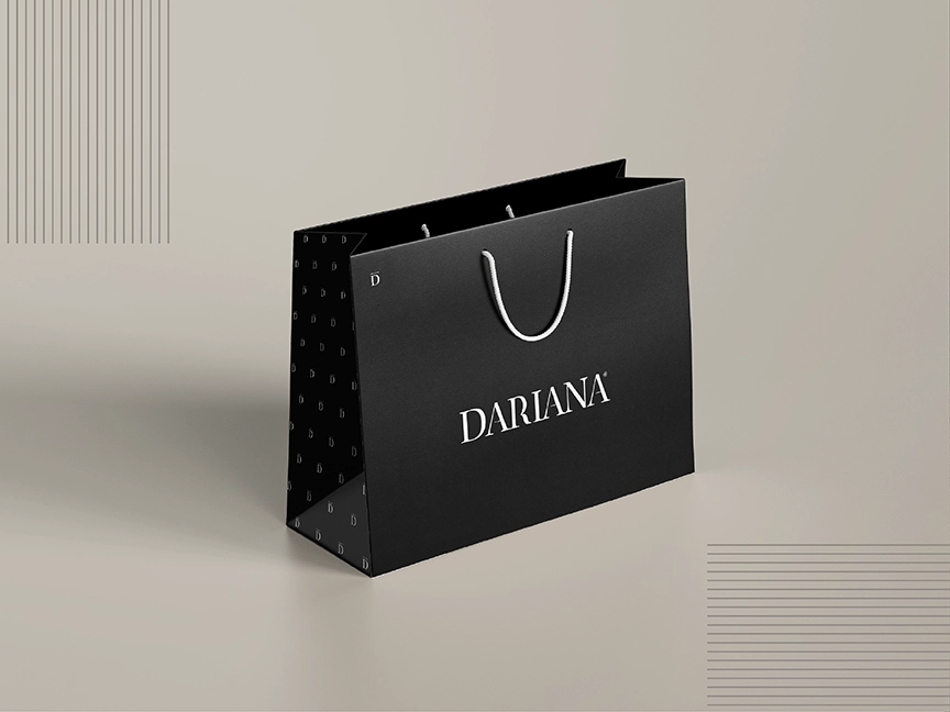
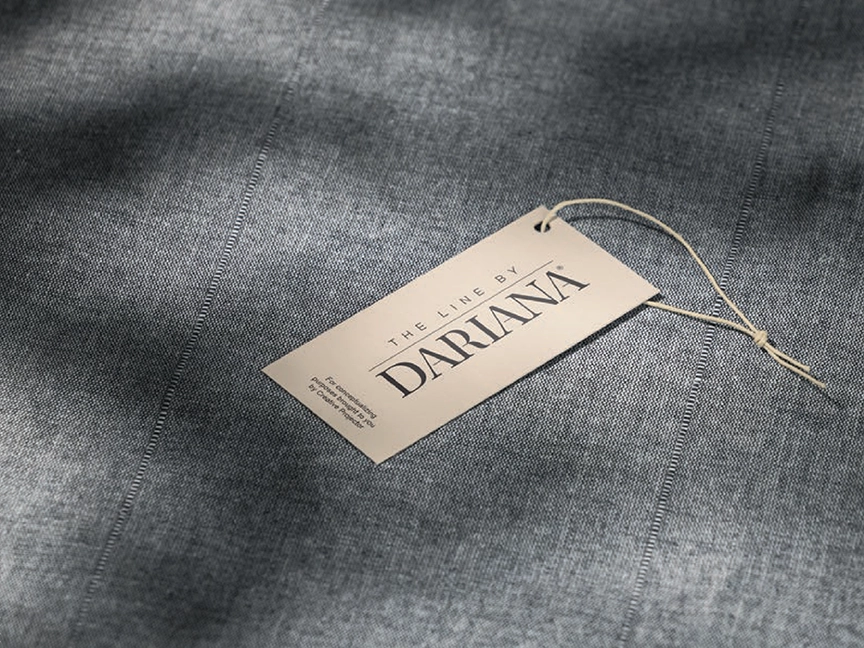
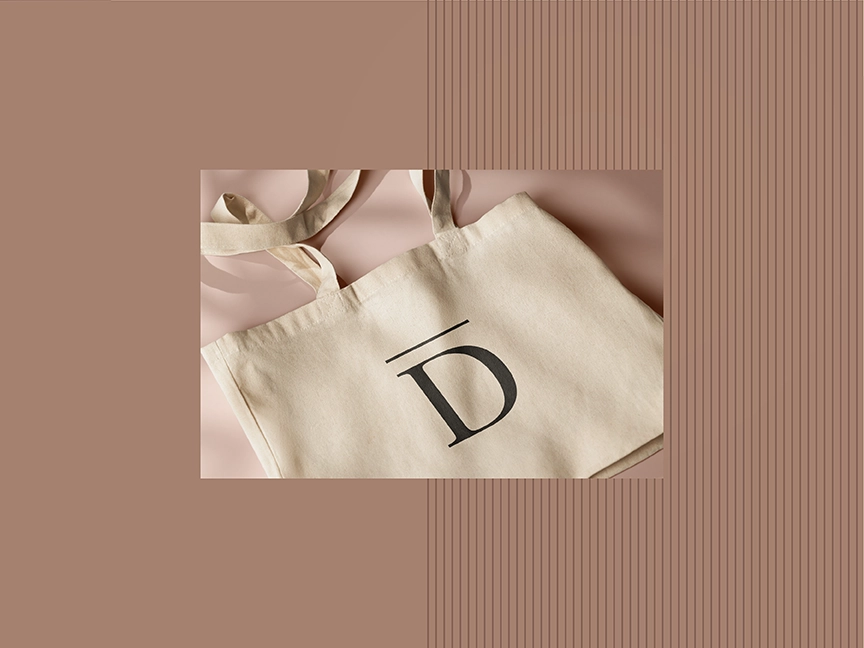
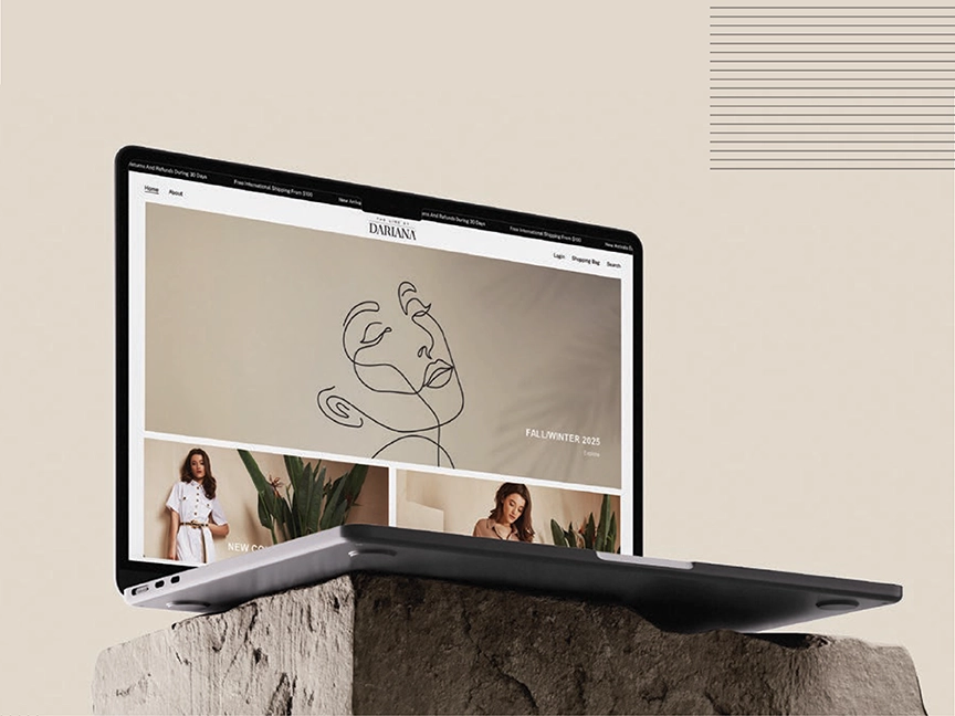
The Line by Dariana needed a fashion identity that felt modern, feminine, and editorial while remaining versatile enough to support future collections. The solution centers on a refined high-contrast wordmark, paired with a restrained neutral palette and elegant campaign imagery.
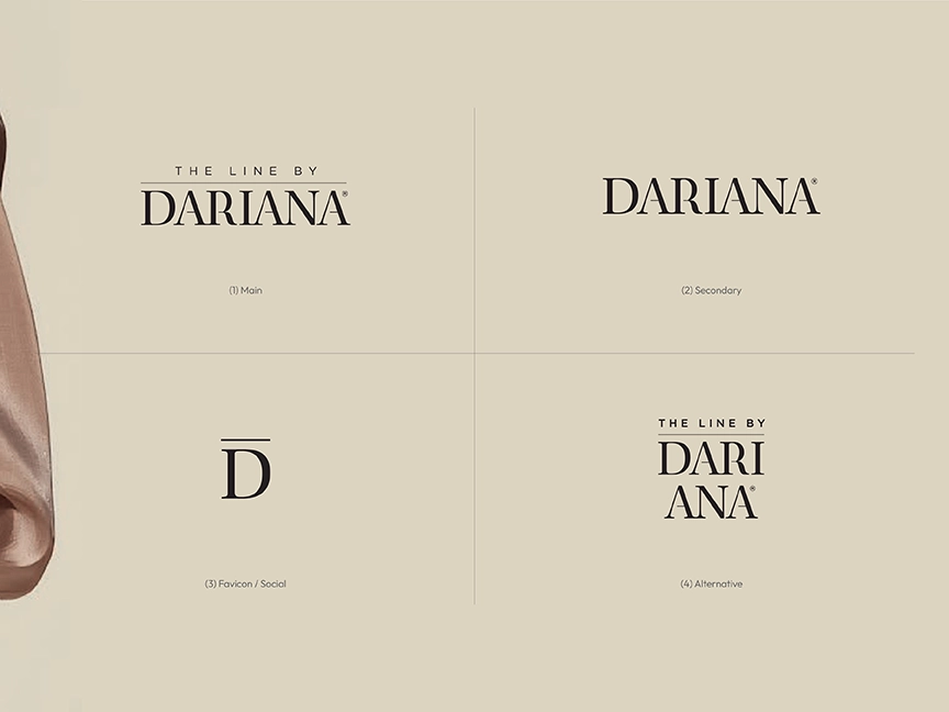
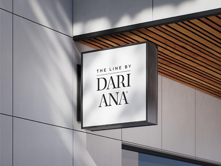
A complete family of primary, secondary, social, and alternative logo treatments allows the brand to remain recognizable across storefronts, garment applications, packaging, social media, and promotional materials. The resulting system gives the label the sophistication of an established fashion house while maintaining a distinctive, contemporary personality.

Sanfoot By Jacaranda
Premium Service Businesses
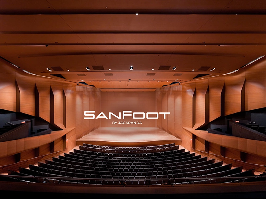
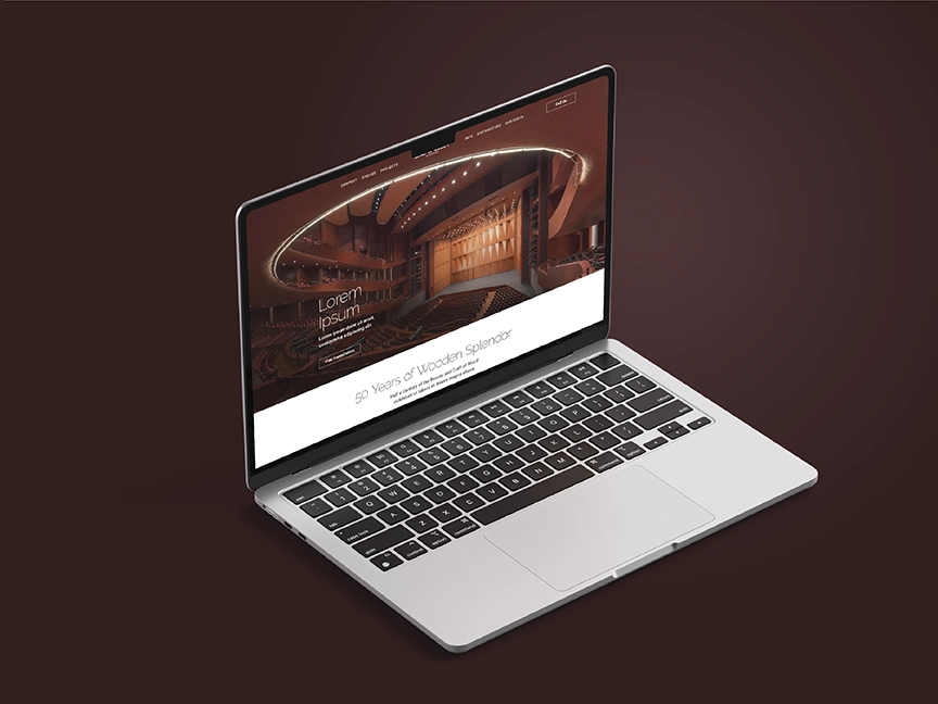
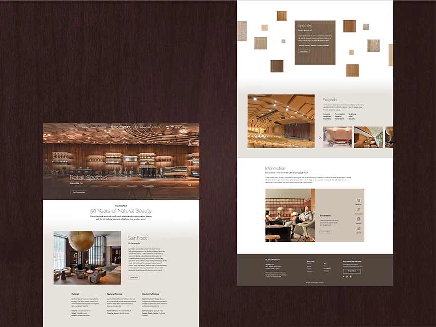
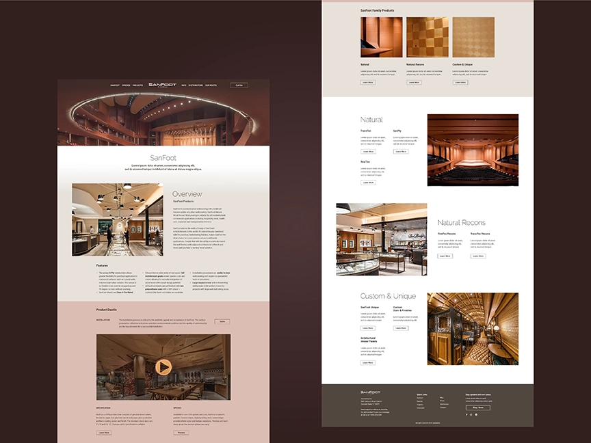
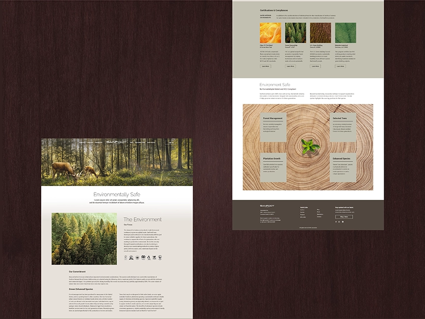
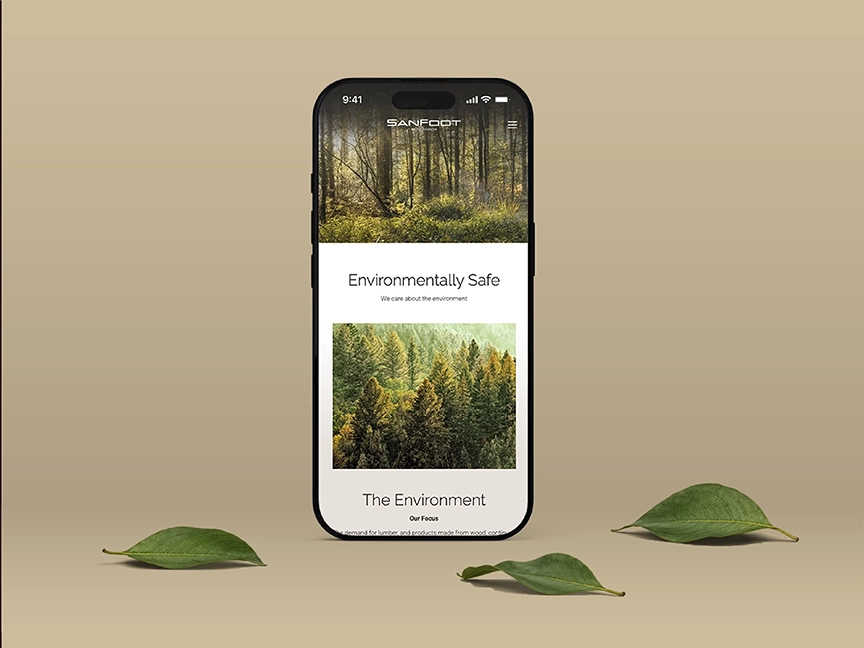
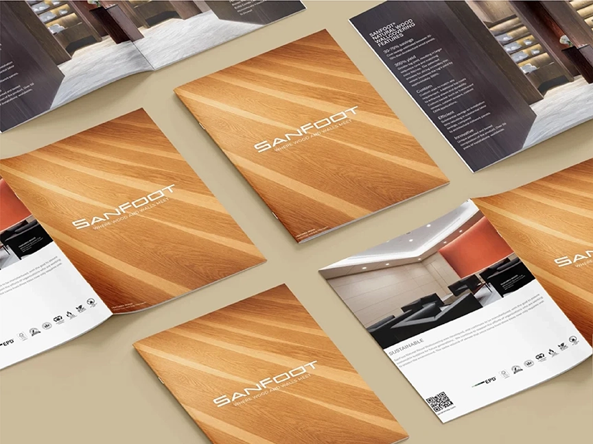
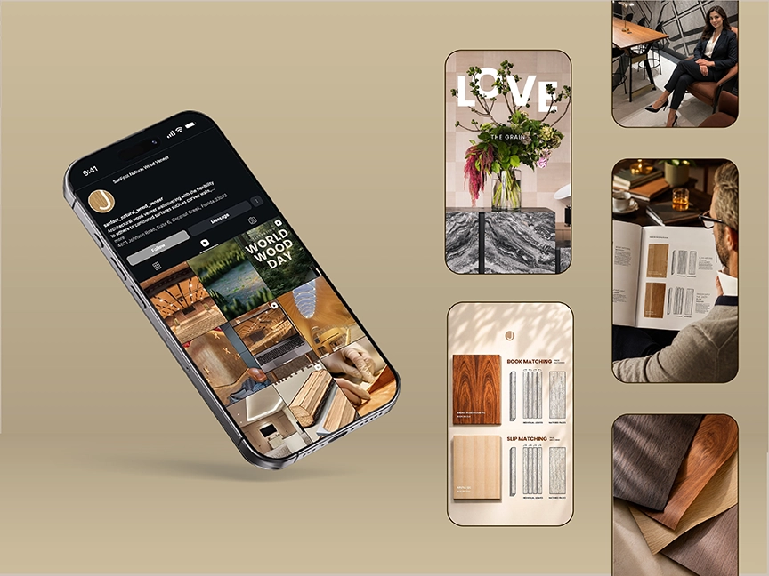
SanFoot by Jacaranda required a digital presence capable of presenting an architectural material with the same richness and precision found in the finished environments it helps create. The creative direction focuses on immersive project photography, natural wood tones, elegant spacing, and a streamlined editorial structure.
The website experience was designed to help architects, designers, and specifiers explore applications, wood species, project examples, and technical information without diminishing the visual impact of the product. By balancing inspiration with useful product content, the work positions SanFoot as both a premium material and a trusted resource for sophisticated architectural interiors.
Twelve AM Water
Lifestyle Brands
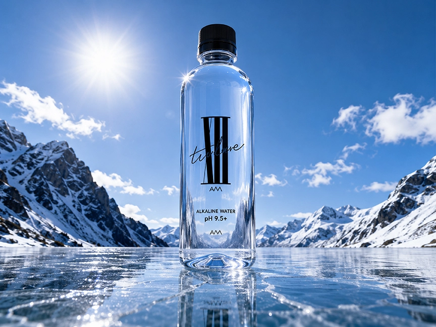
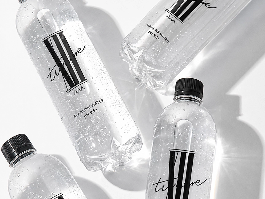
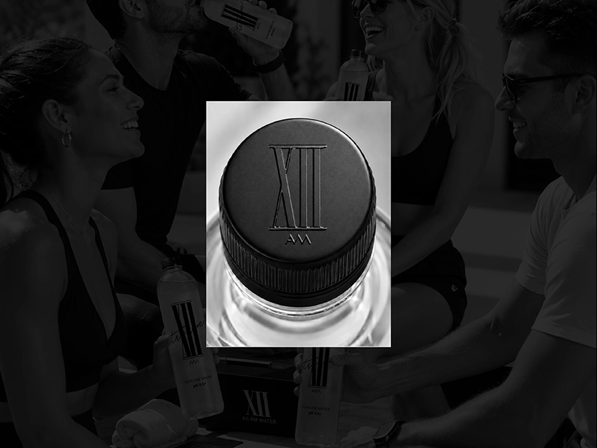
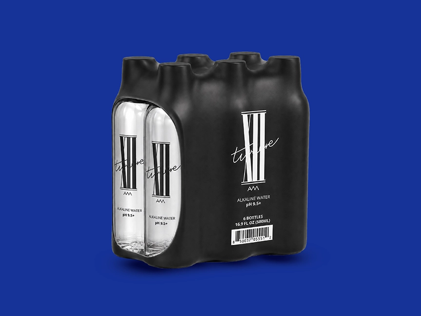
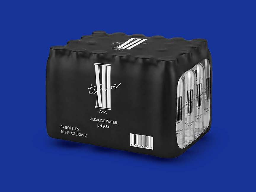
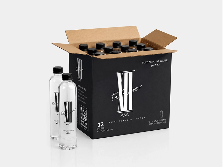
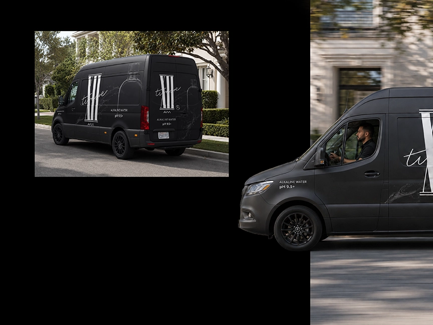
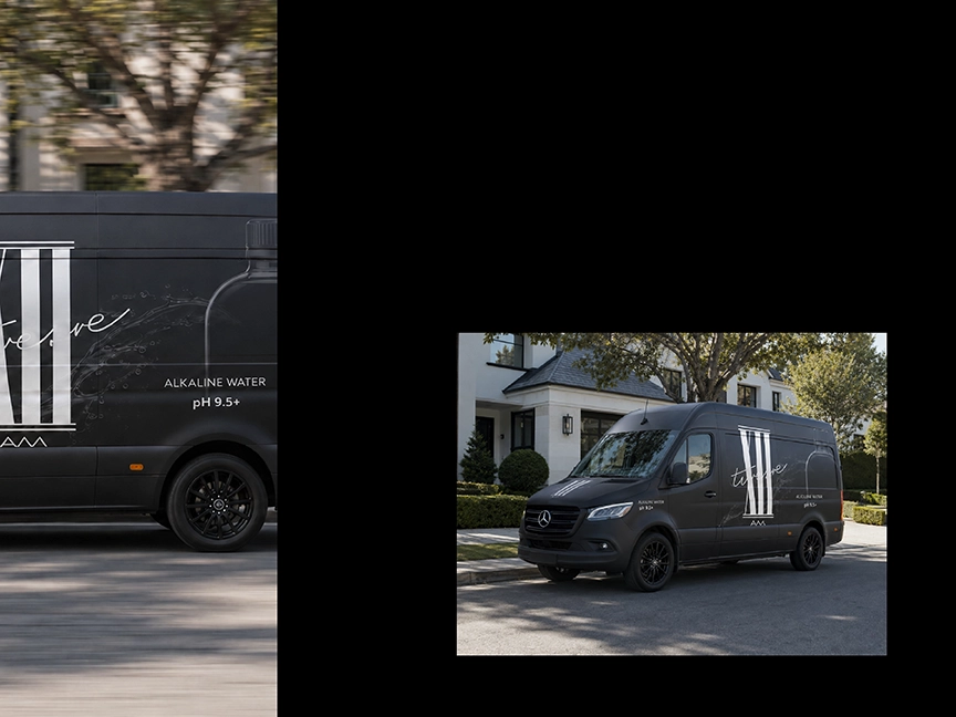
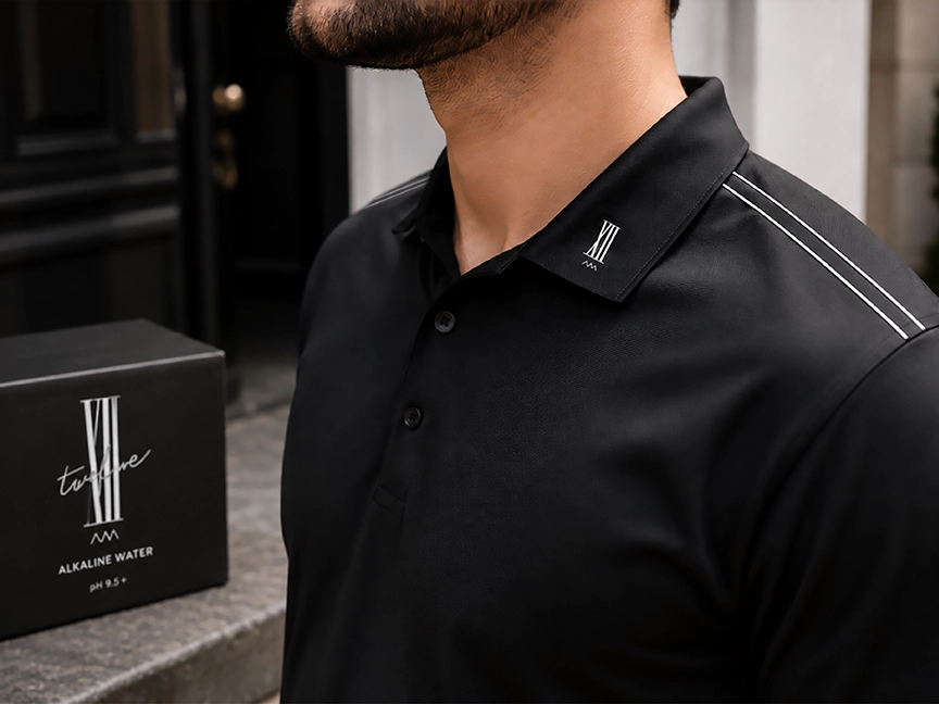
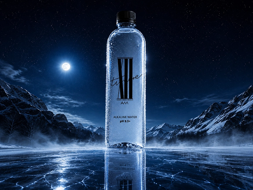
Twelve AM Water needed a brand identity that could transform alkaline water from a functional product into a modern lifestyle statement. The visual system uses a distinctive Roman-numeral-inspired mark, expressive handwritten detail, and a minimalist black-and-white palette to create a clean, fashion-forward presence.
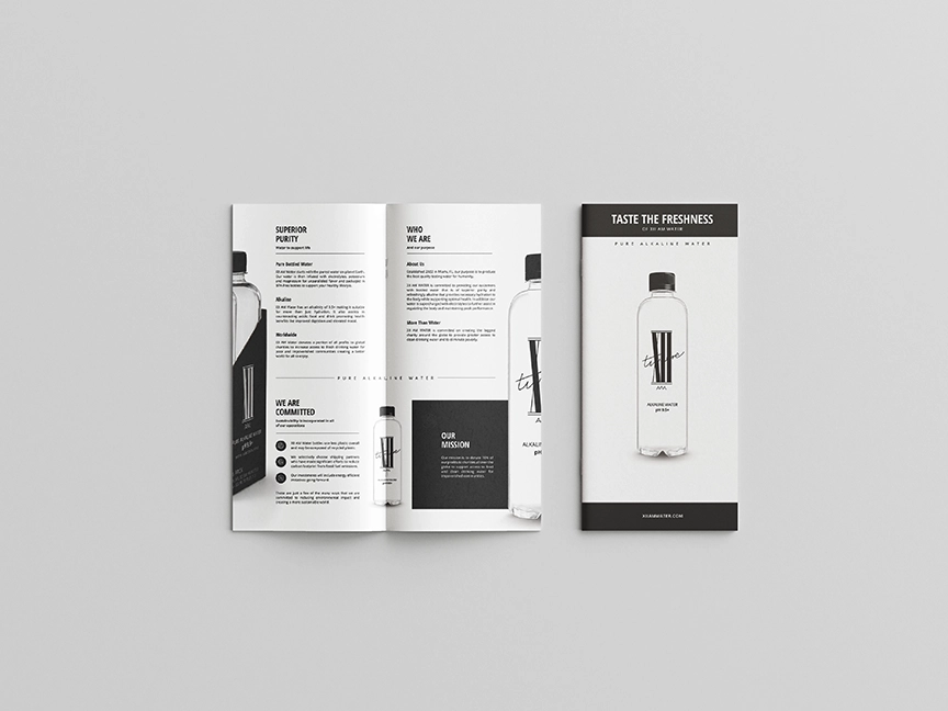
The identity was applied across packaging, product imagery, brochures, and promotional collateral, maintaining strong recognition while allowing the clarity and purity of the water to remain visible. The result is a bold yet minimal brand that feels equally appropriate in fitness, wellness, hospitality, and everyday lifestyle settings.